Have you ever tried a new-to-you beer and thought “This beer is fine, maybe even good, but it’s just not very…interesting?” Or maybe you saw a redesigned label for a beloved beer and thought “It’s nice enough, but it just seems to be missing something.”
Over the years we have observed common flaws in the processes used to gauge consumer reaction to potential recipes – or labels, or other marketing initiatives. So, if you’re planning on doing any consumer research along these lines, it would be good to be forewarned about some potential pitfalls to be avoided.
In a recent Insights piece, we discussed how “In Taste Tests, Context is Everything.” That article focused on execution; now we’ll discuss the analysis of taste test results.
In particular, let’s say you’ve already conducted a taste test among two recipes you’re considering for a new beer in planning stages. You’ve recruited a cohort of 150 beer tasters to participate in the test. Maybe you’ve invested the money required to ensure you have a truly representative sample of the target drinkers for this beer, or maybe you didn’t want to spend that much and so you simply recruited people in your taproom. This latter choice isn’t the flaw we’re discussing today – we think it can still provide some insight given limited budgets, as long as you keep that context in mind when assessing the results.
We’ll also assume the research process itself was properly disciplined, including best practices like rotating the two beer samples – i.e., making sure half the participants try Beer A first and half try Beer B first to avoid “order bias,” defined as the tendency to rate the first beer they try differently than the second beer. And while you’ve likely asked each participant a series of questions about both of the beers in turn, we’ll also assume you’ve used a 9-point scale to quantify their responses: “Overall, please tell us how much you liked this beer using a 9-point scale, where 9 means you liked it extremely and 1 means you disliked it extremely.”
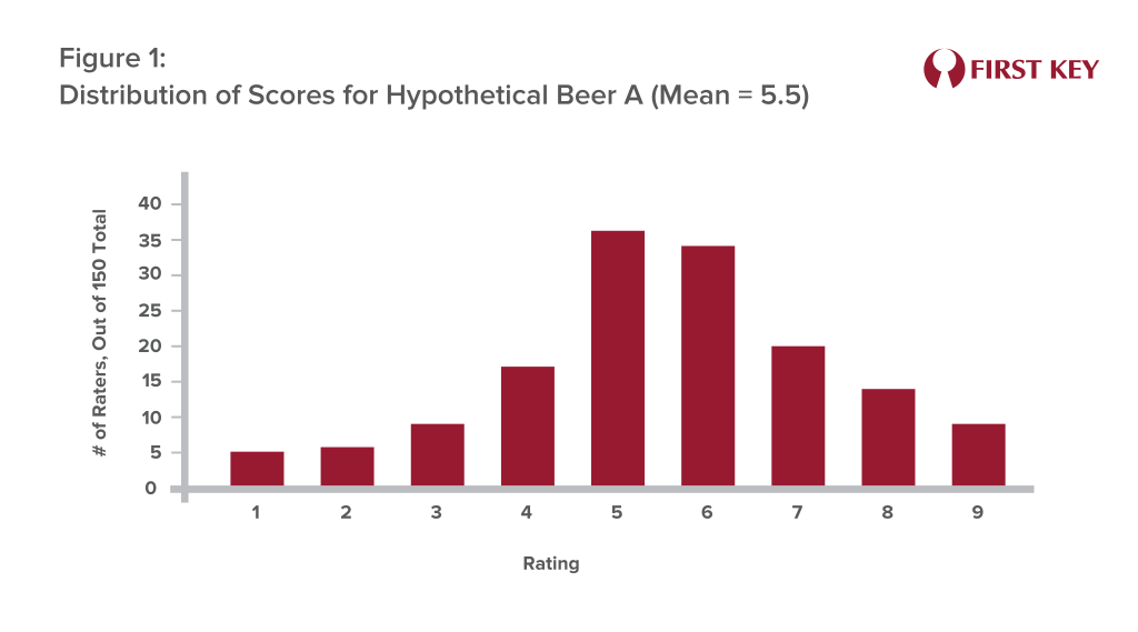
Then comes the reckoning: how did each beer score? Let’s say you tabulate the results and find that Beer A had an average rating of 5.5 while Beer B generated an average rating of 4.9. It seems we have a clear winner – or do we?
Using an average, or mean, as the final arbiter of which recipe will perform better in the real world can be a flawed approach. Let’s take a look at the distributions of the “overall liking” rating for both beers. Figure 1 shows that distribution for Beer A, and it reveals something pretty close to what statisticians call a normal distribution, or a classic bell curve – a lot of people gave Beer A ratings in the middle range, with fewer giving it very low or very high ratings.
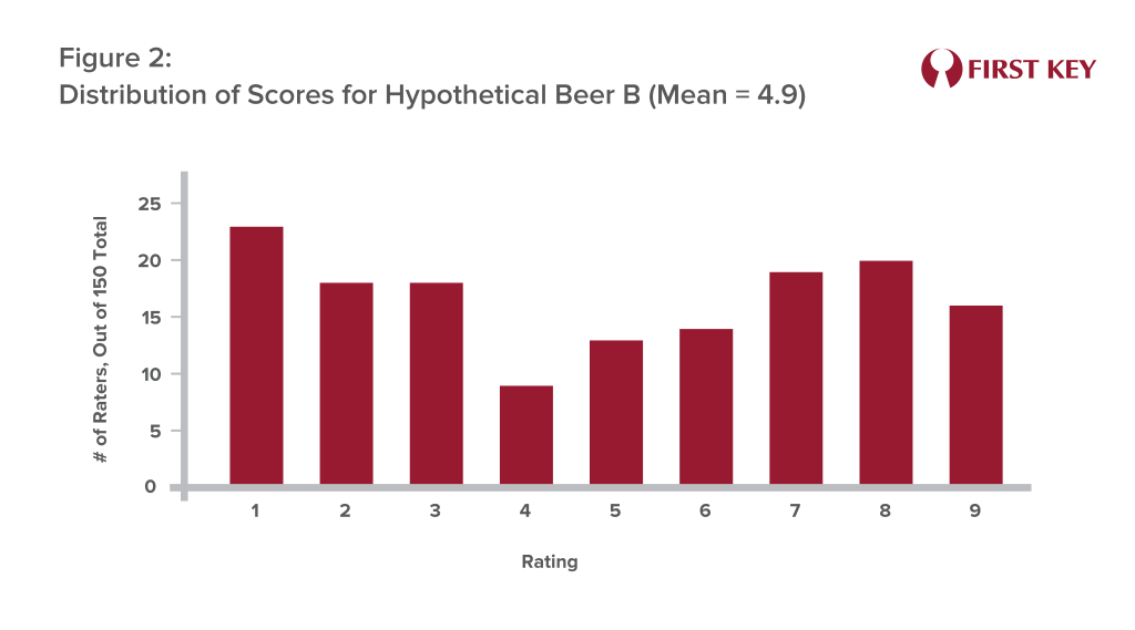
But the distribution for Beer B may look more like Figure 2 – a lot of people seemed to actively dislike it, including 23 participants who rated it a “1.” This is why Beer B’s score was lower, as these participants’ very low scores were dragging the overall average down.
But these differing distributions aside, Beer A is still the “winner,” right?
We would argue that the answer is “No.” In all likelihood, in our view, although somewhat polarizing, Beer B will sell better in the real world since 7s, 8s and 9s are much more likely to be re-buys.
That’s because, even though the high frequency of 5s and 6s earned by Beer A seem like “pretty good” scores, they’re not going to be motivating. Nobody needs a new beer that they rate a 6, because they already have plenty of choices that they would rate as a 7, 8, or 9. Nobody needs another “pretty good” beer when they already have several excellent beers to choose from. In practical terms, a rating of 6 is not much better than a rating of 1; the first rater thinks the beer is “not bad,” while the second hates it, but neither one of them is likely to skip a purchase of a beer they regularly enjoy in order to buy this new beer.
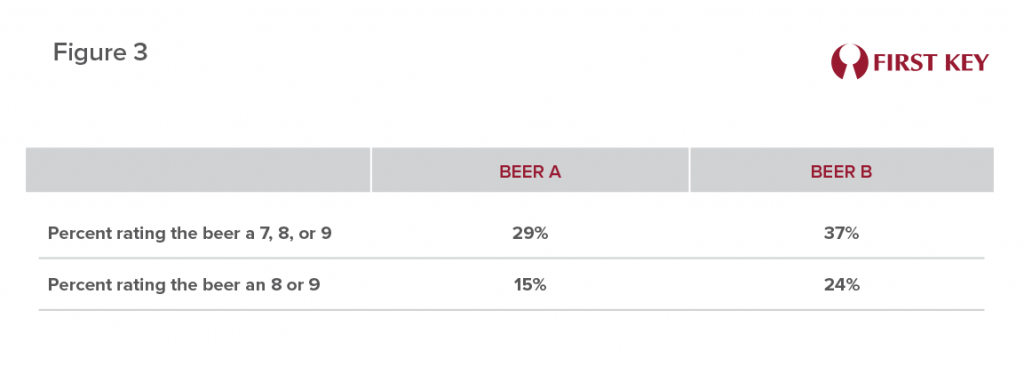
We would suggest that in almost all cases, the better way to score the results of such a test is to calculate the percentage of participants who rated the beer as a 7, 8, or 9 – or maybe even leave out the 7-raters and calculate the percent who gave the beer an 8 or 9. These are the drinkers who may well decide this beer tastes better than something they’re already drinking, and thus will be motivated to go out and buy it.
This approach is captured in Figure 3, summarizing the data underlying Figures 1 and 2. It shows that Beer B was rated as a 7, 8, or 9 by 37% of the participants, compared to only 29% who gave such high ratings to Beer A. Focusing only on 8s and 9s, Beer B received these ratings from 24% of tasters, while Beer A garnered 8s and 9s from only 15%. In our interpretation, Beer B is the clear “winner” of this test – despite producing a lower average score.
In many if not most cases, a beer with more 7s, 8s, and 9s may well also generate a higher mean score. But in other tests the above-described problems may well emerge. The truth is, the approach of choosing the “winner” based on the mean can often favor the beer (or the label or the marketing program) that’s more middle-of-the-road, bland, or inoffensive – because, while few are excited about it, virtually no-one actively dislikes it. Or, as stated earlier “good, but not very interesting” or “nice enough, but missing something.”
And in truth, few brewers would likely be excited about releasing a “pretty good” beer. We don’t think it’s an exaggeration to say that excellence is the goal of every brewer. And so our conclusion might well be framed this way: the goal of excellence needn’t be compromised for the sake of being consumer-centric. It’s still a winning proposition to shoot for the sky, or in more quantifiable terms, a 7, 8, or 9.
To learn more about research and projections, please contact us